The rise of mobile usage for web viewing is affecting, and much, this branch of design. The need for simplification and readability of the size of the display give a twist to the famous phrase -that +
As always with the trends that mark the next step, these are a help to our work, but there is no need to follow the verbatim, because if not, would standardizing the world.
Without further ado, here are the new features (some are not) that will dominate the 2015 logo design.
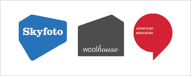
Simple and symbolic forms.
Shapes that represent an object but a very simple manner, intense colors with contrasting colors and typography will make the logo more memorable.
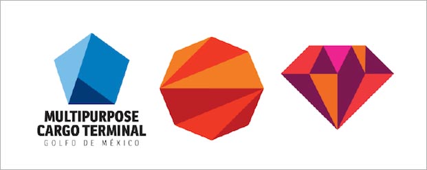
Hexagonal shapes.
Without further ado, here are the new features (some are not) that will dominate the 2015 logo design.
Simple and symbolic forms.
Shapes that represent an object but a very simple manner, intense colors with contrasting colors and typography will make the logo more memorable.
Hexagonal shapes.
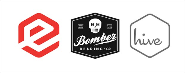
Order, functionality, structure, etc., is the message conveyed these forms. A useful way to draw the viewer's attention.
Vertical typographic logos.
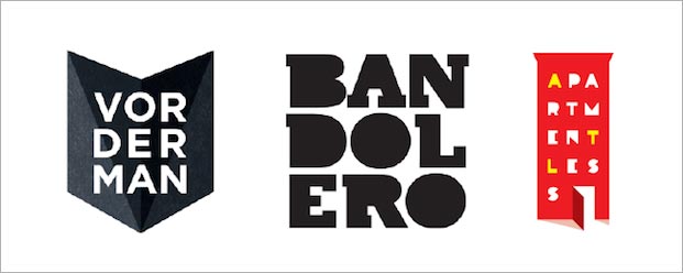
There are countless possibilities of this type of logos I've seen and logos for bars as logos of game developers.
Logos with lines blur effect.
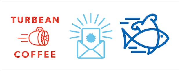
Design more suitable for logos related to the digital world for its dynamism and modernity. Great functionality at small scales.
Logos with spot colors.
This trend continues and will remain for long. Now you can see larger but similar tones color ranges.
Logos Lettering.
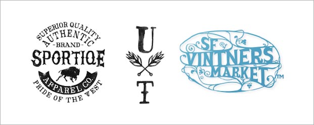
Back to basics. This trend is a bit Alternatively, you may use but not massive and detailed fu retro effect make a dent in 2015.
Geometric logos.
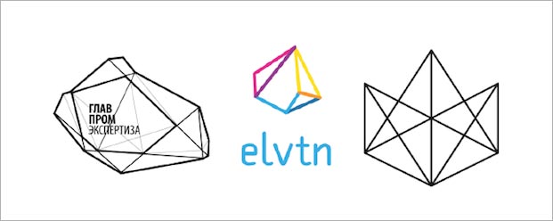
Points 1 and 2 gave hints that this would be another hot trend this season. Now look at packaging, on posters and in all types of artwork. Transmits a very enigmatic feeling based on simple shapes.
Animal Logos and transparencies.
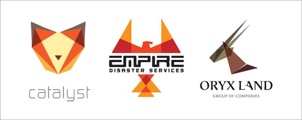
The flat design of the hand brought this kind of artwork. It was a matter of time that began to be applied to logos. Bright colors, shapes, types, nature, etc. An animal is always a good way to remember and identify a brand.
Despite trends, each contribute their personal touch.
These seem to be a few signs to know where the shots in 2015, so, you can begin to experiment and go adelantándoos the times.
Font: Waaket
No hay comentarios:
Publicar un comentario